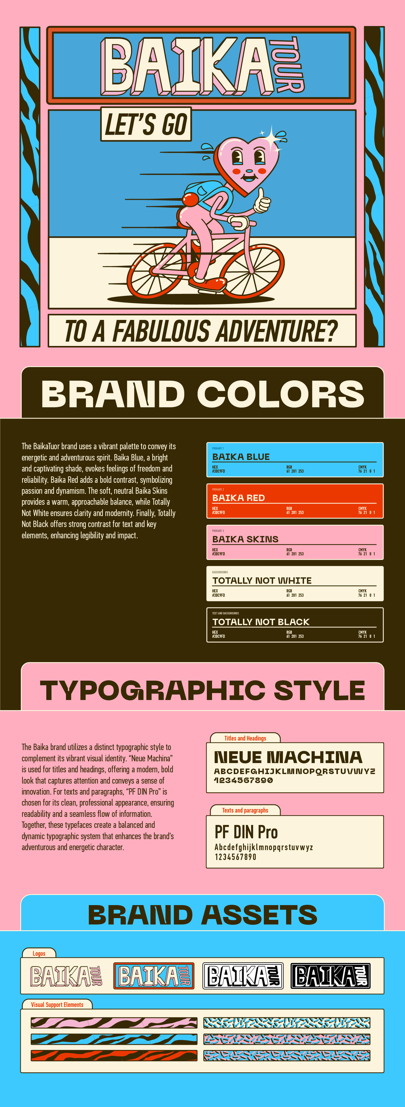
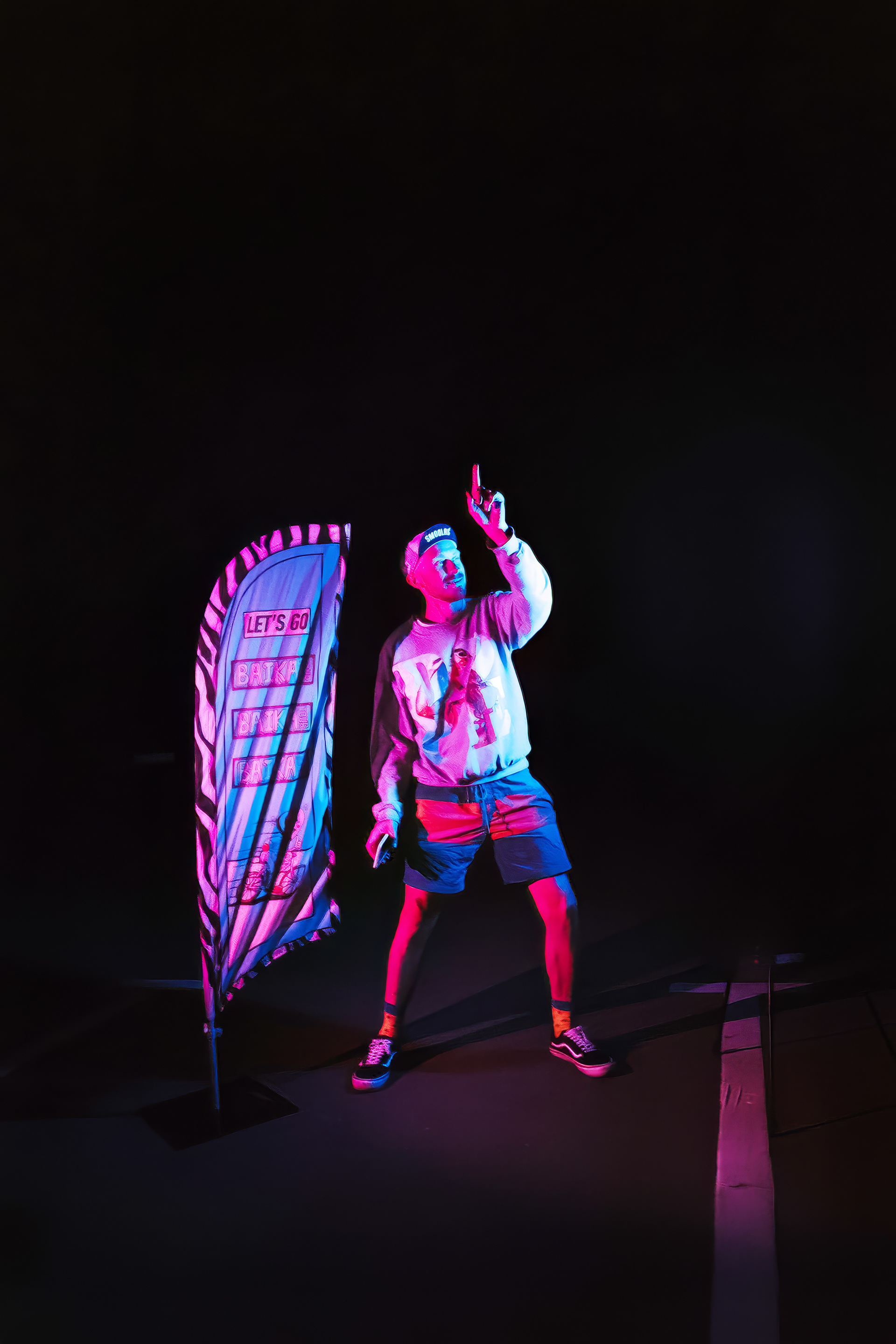
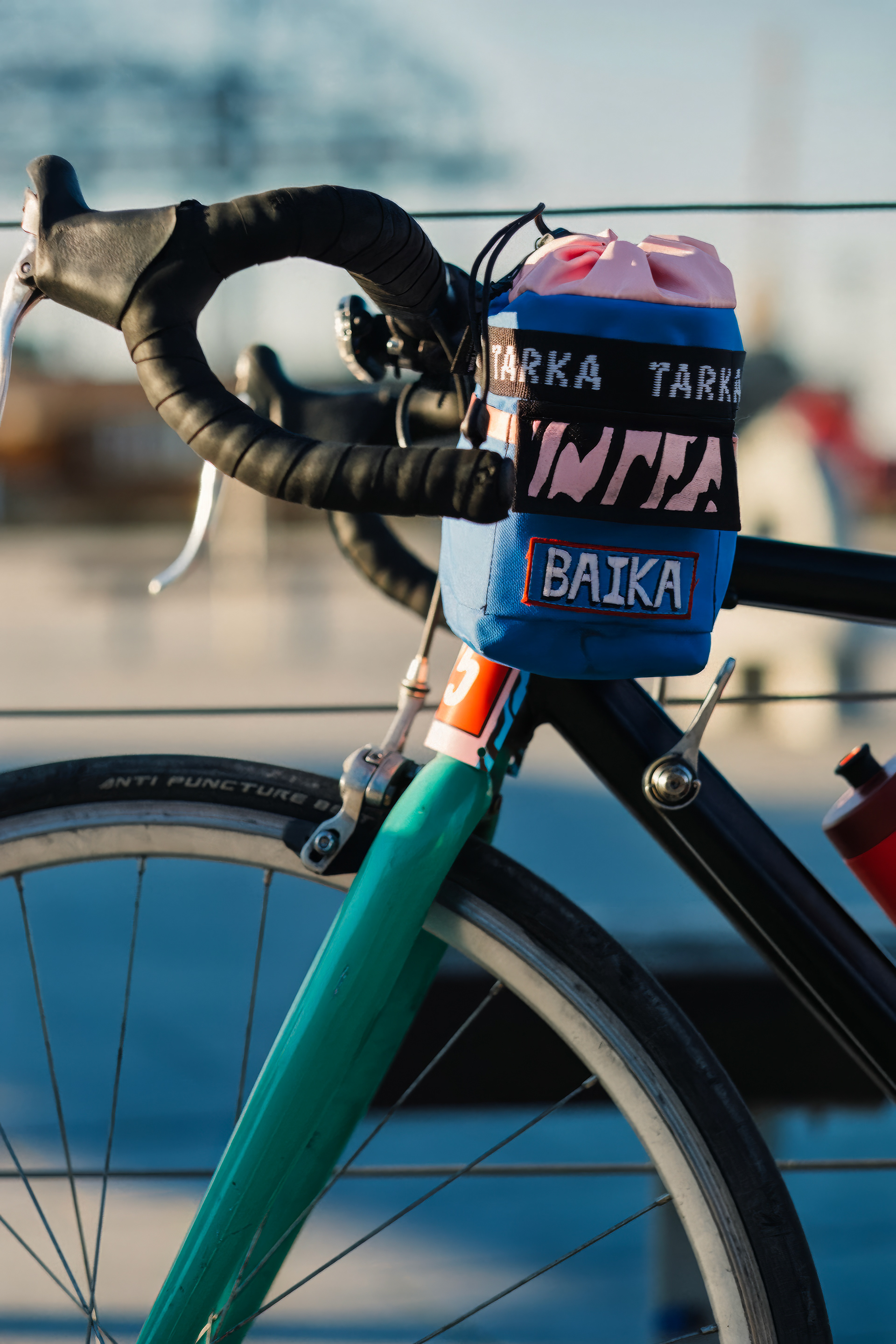
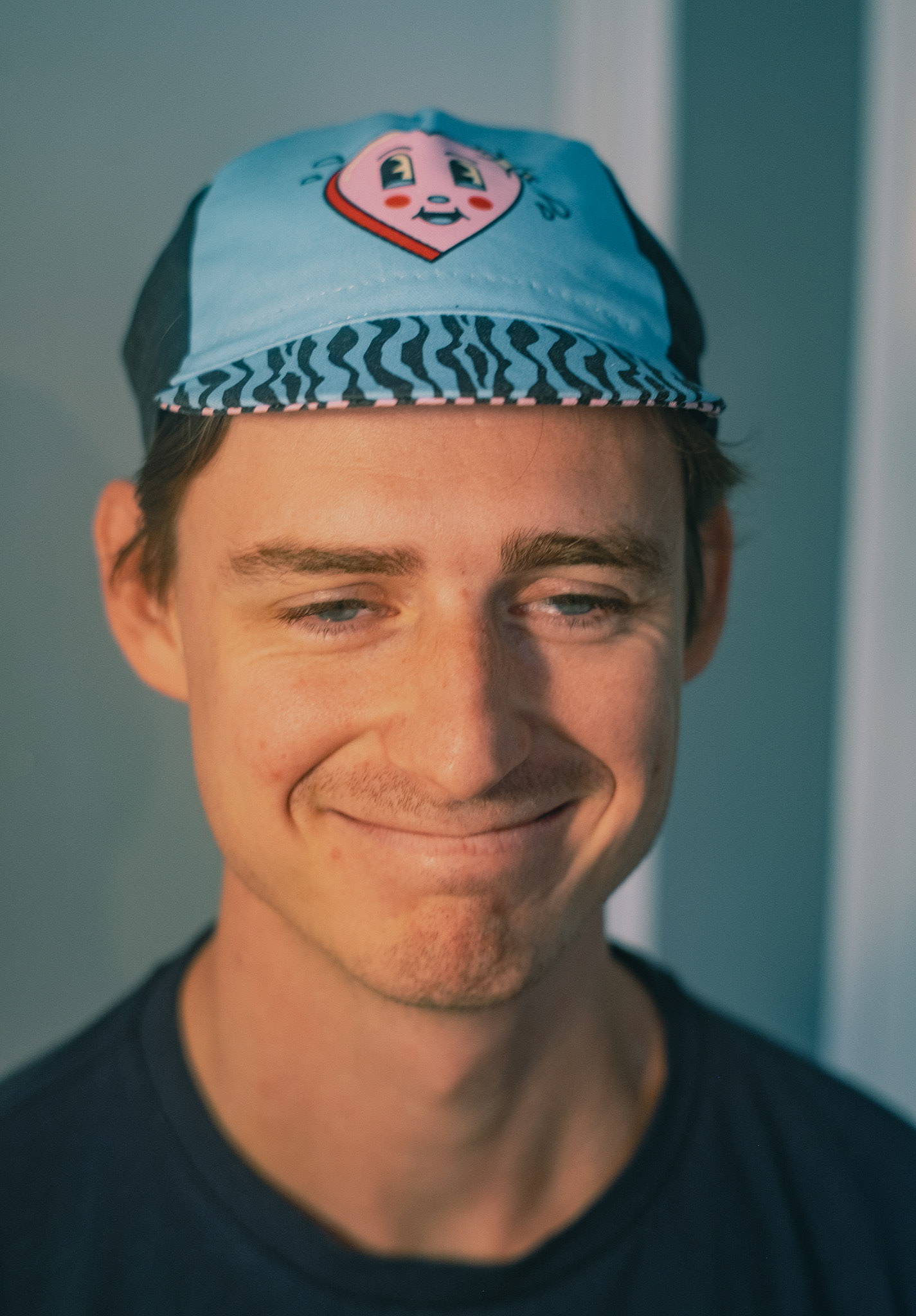
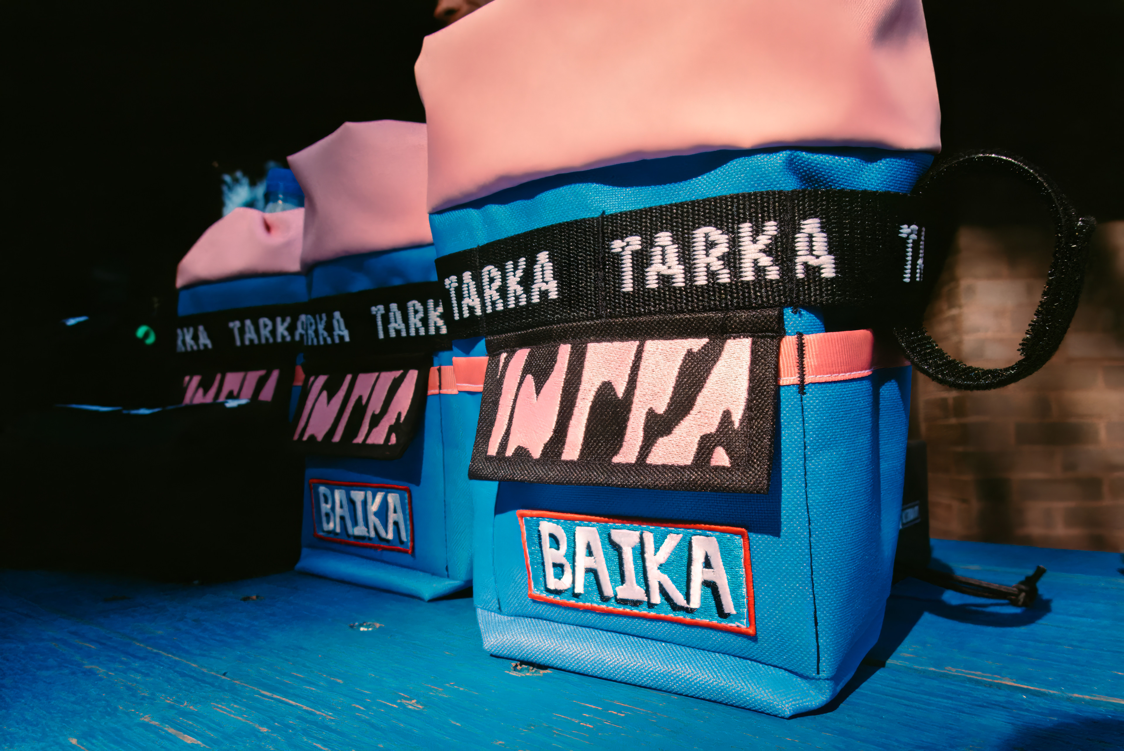
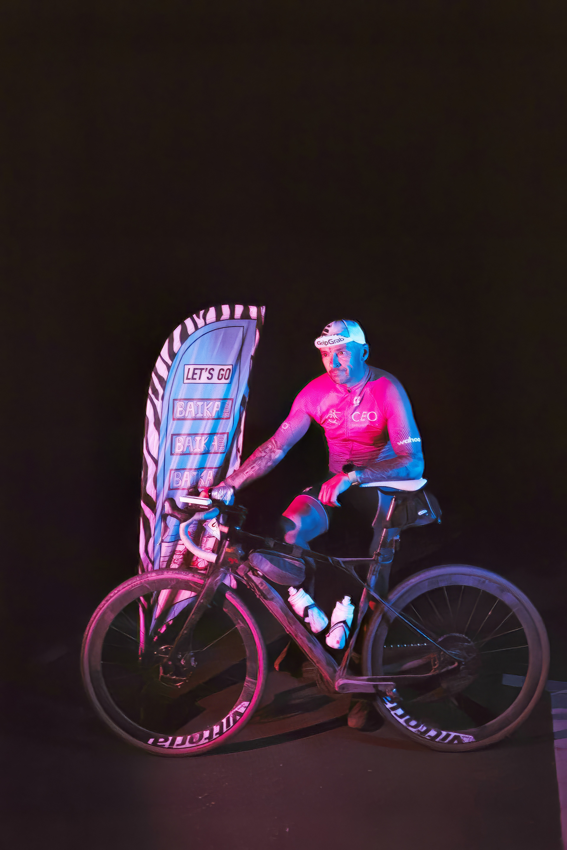
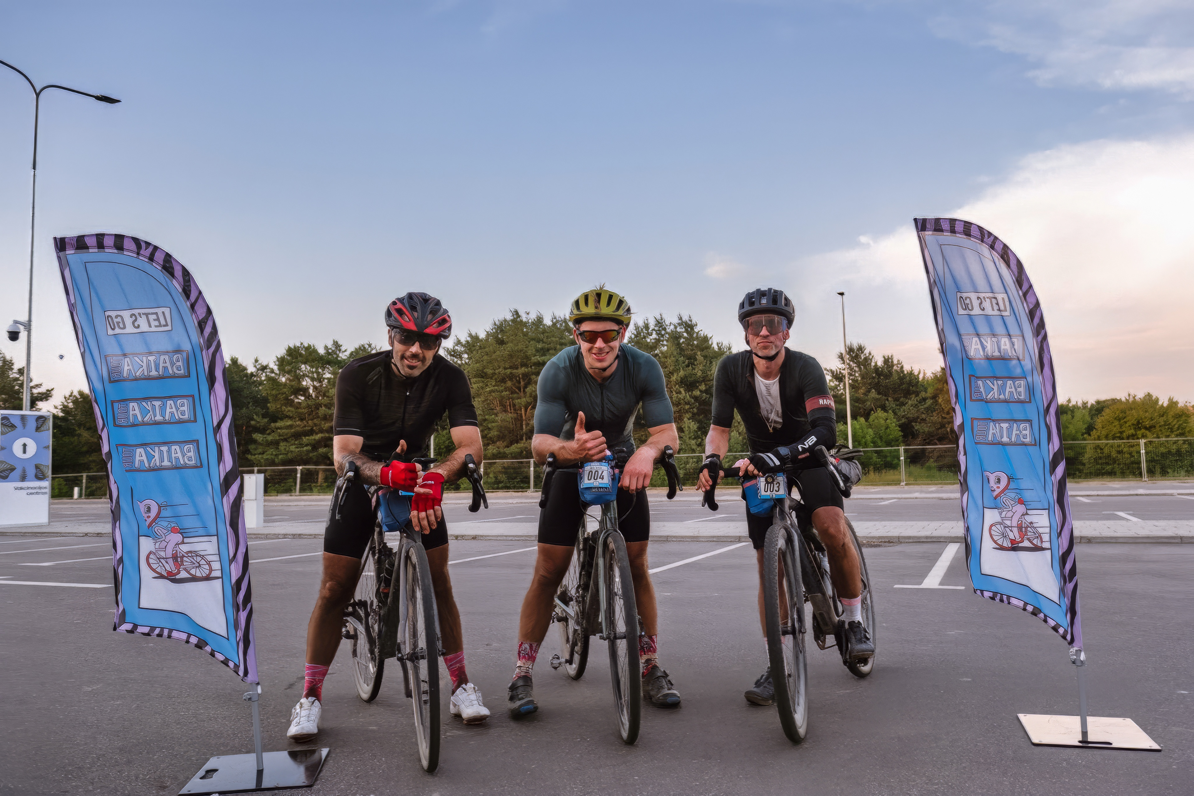
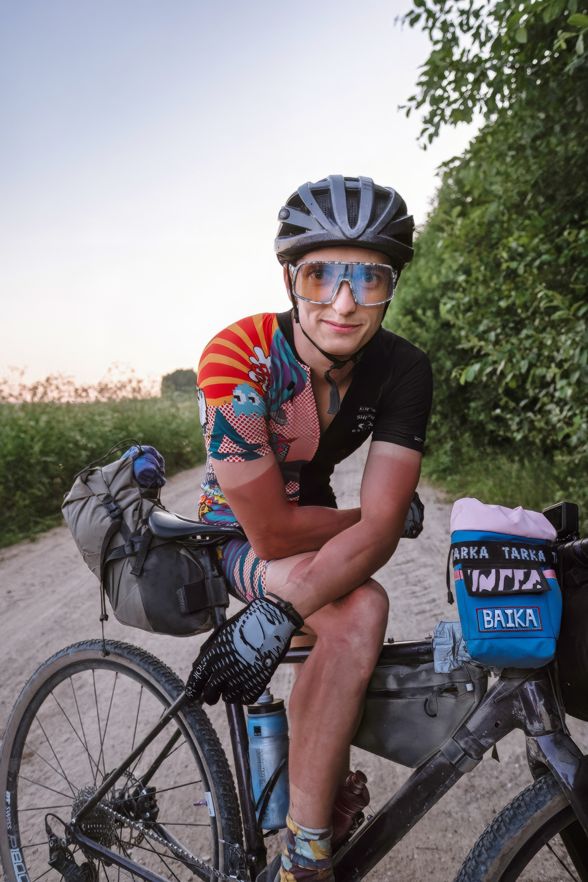
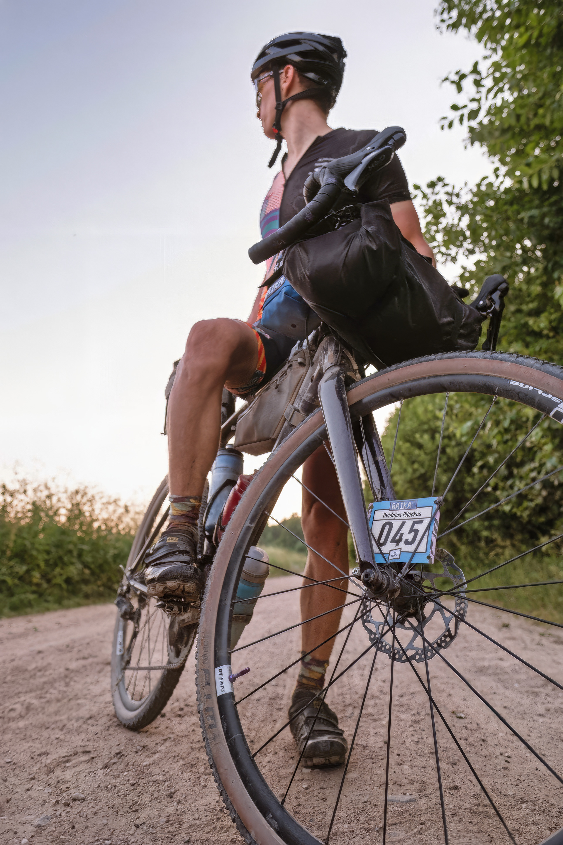
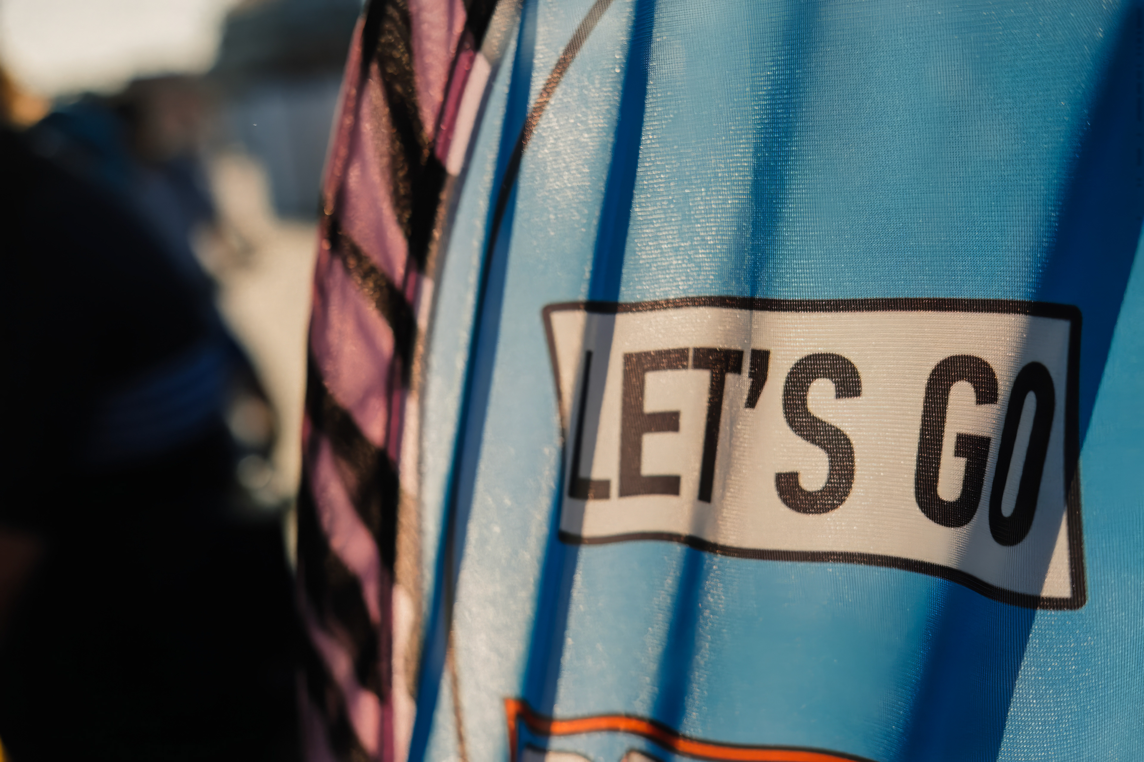
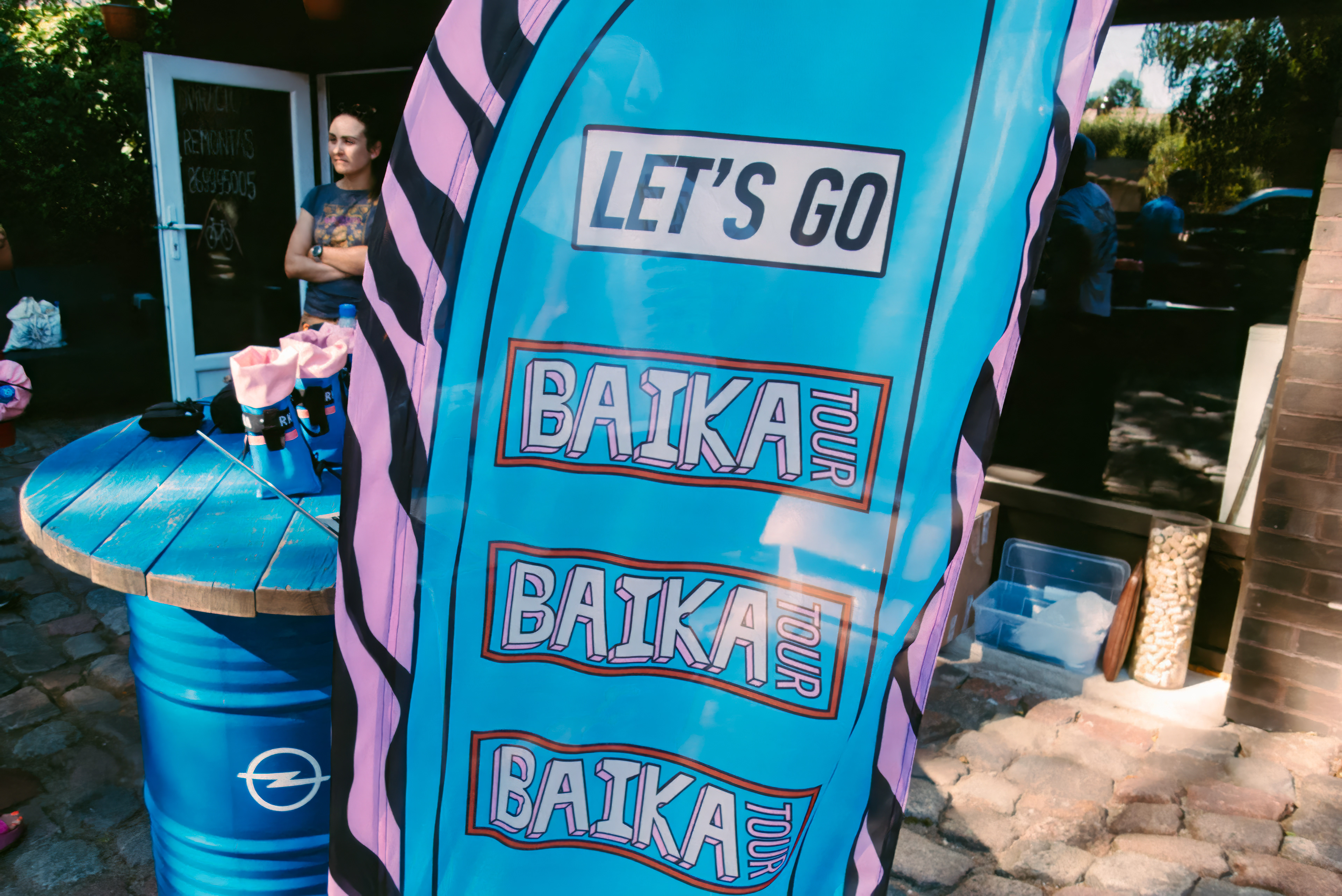
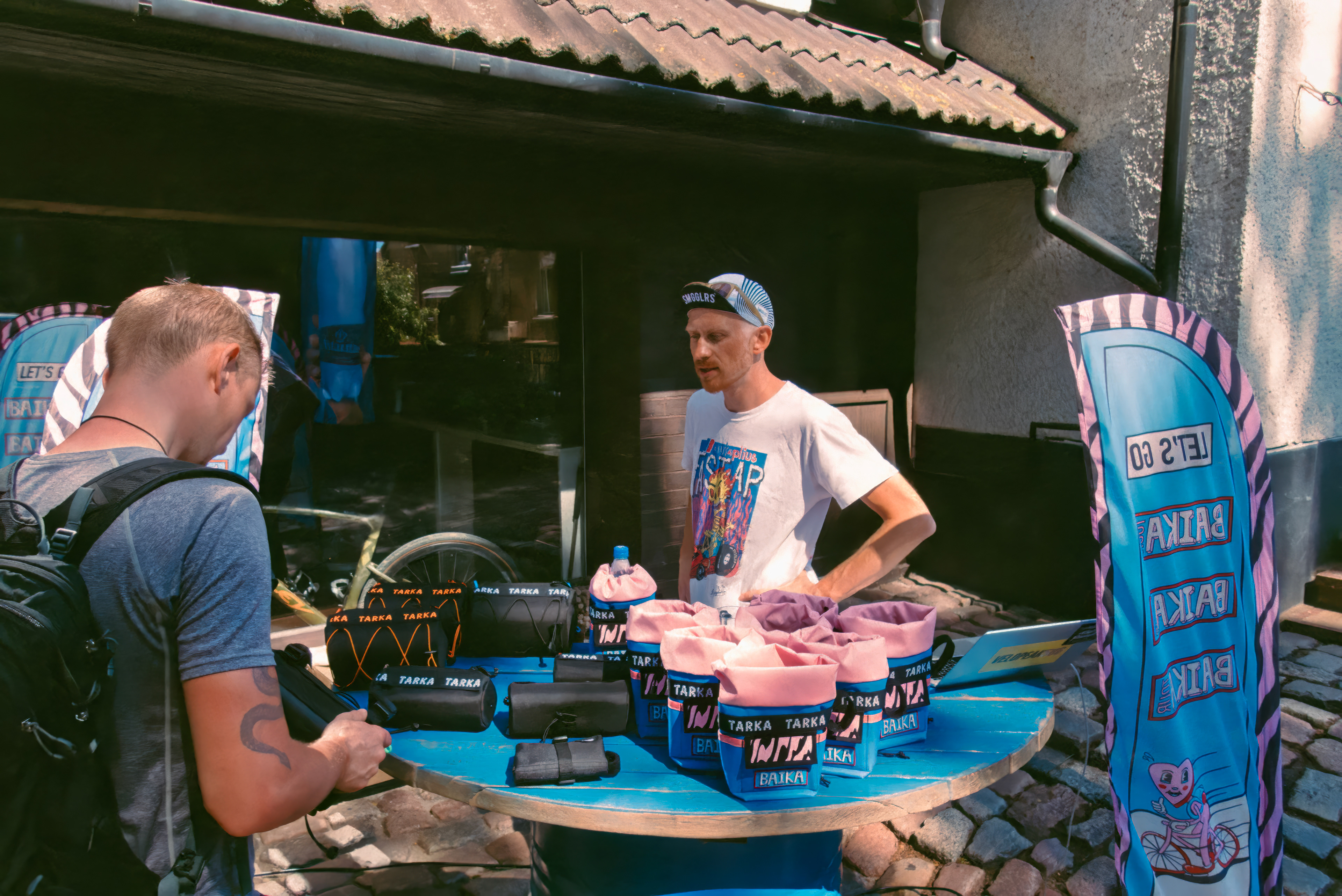
BAIKA TUOR
Objective
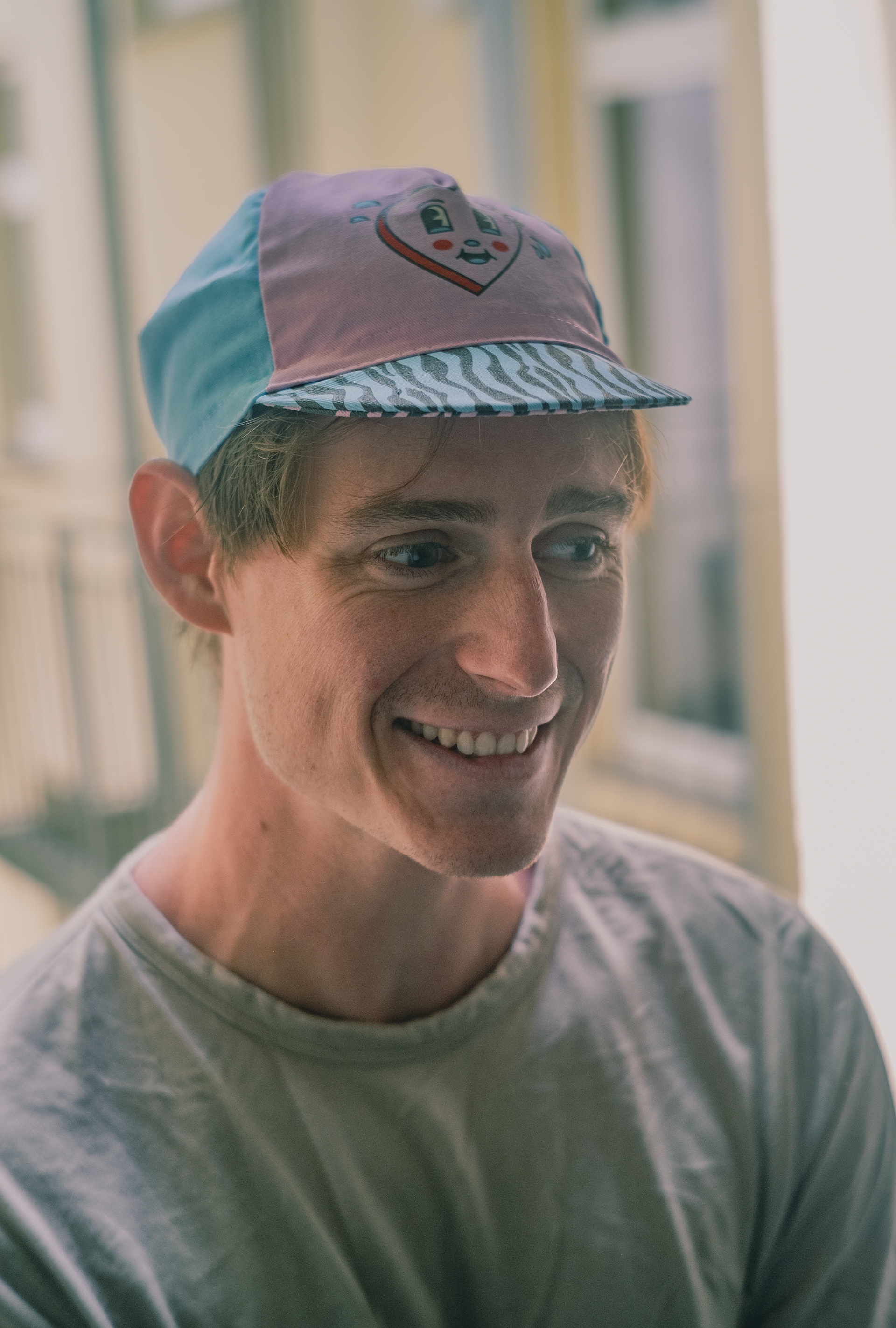
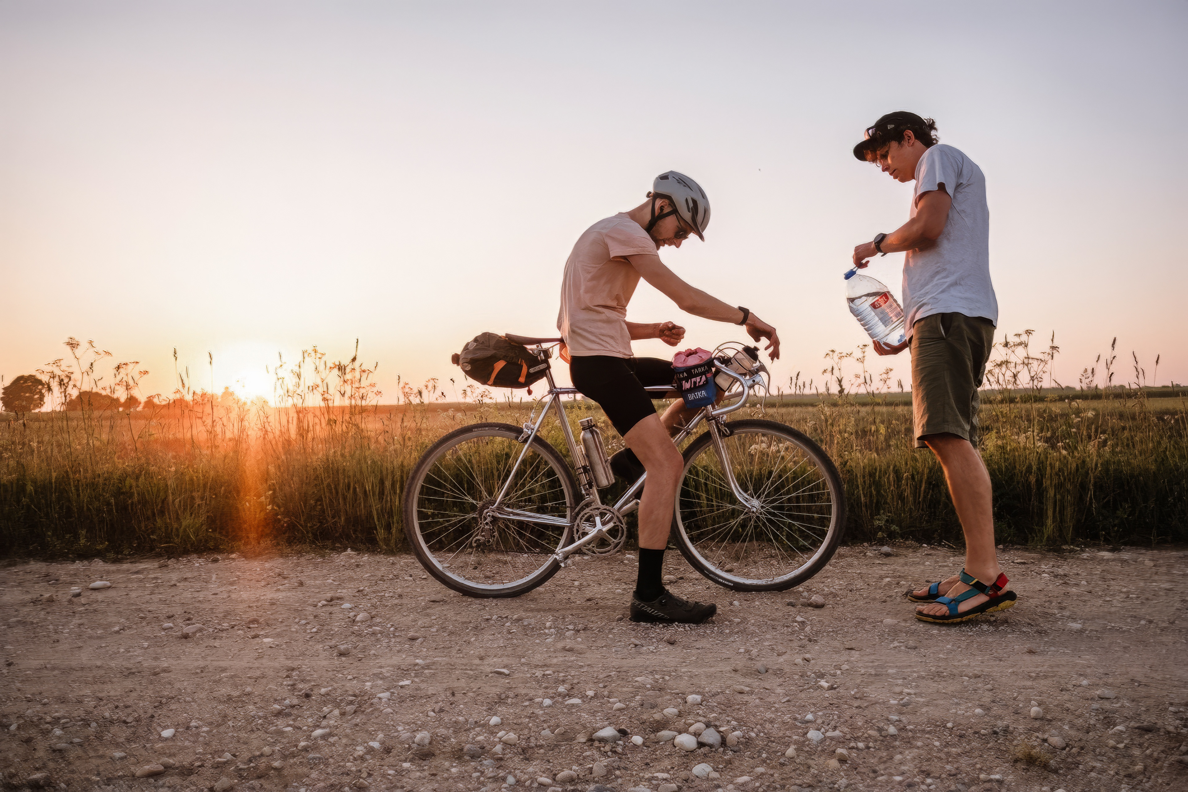
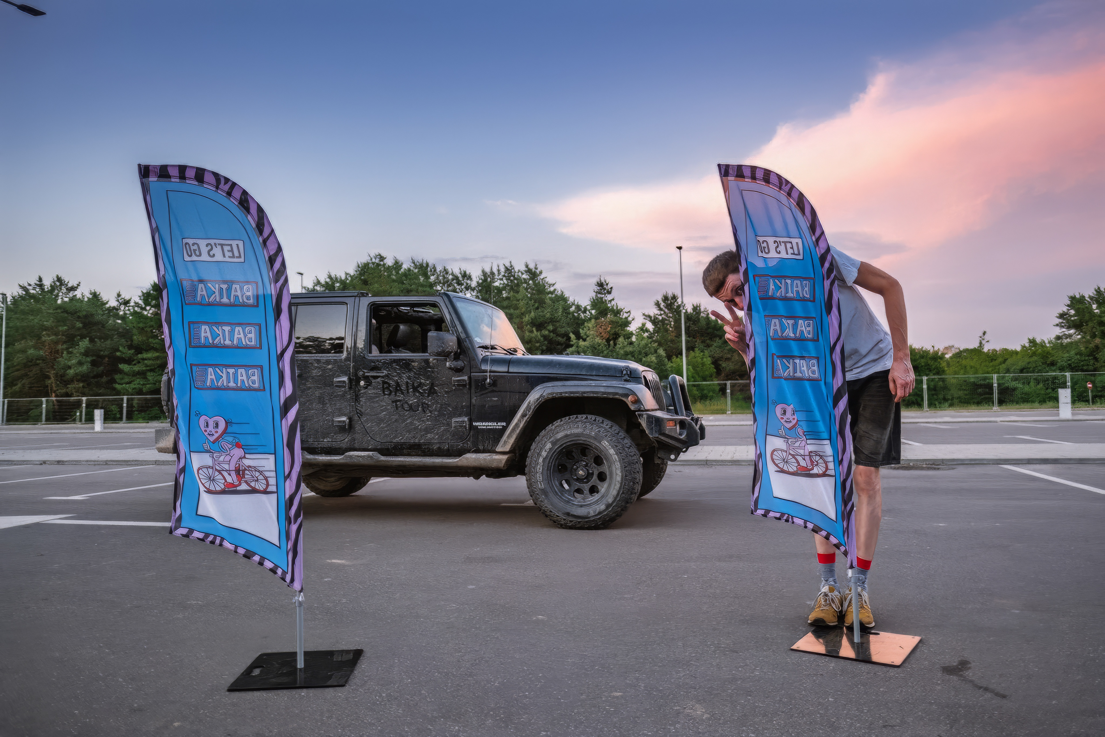
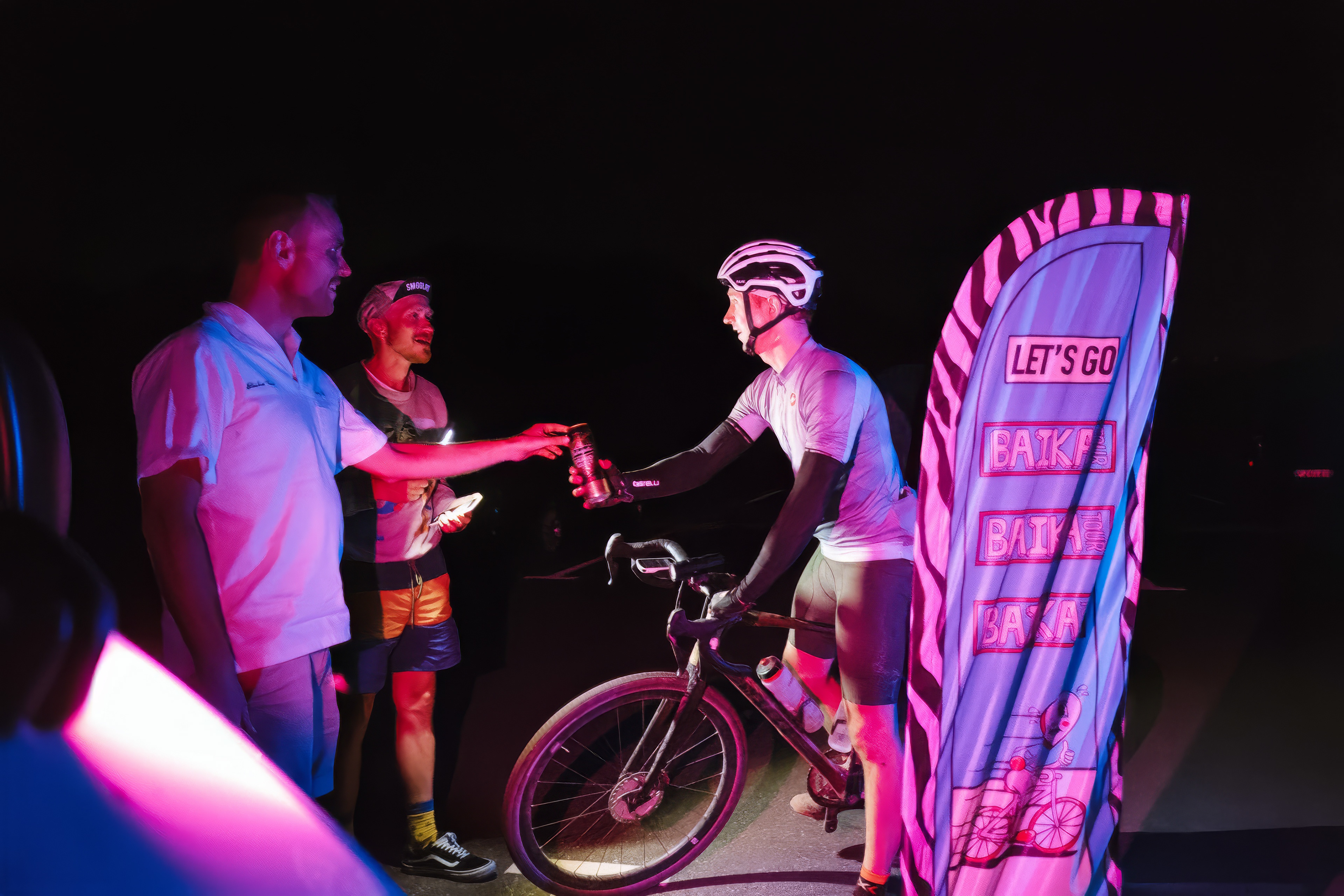
The objective of the Baika brand is to create a vibrant and enjoyable summer ride experience, culminating in a celebratory party on the final day. Central to this vision is the creation of a memorable character that will continue to be a key element of the brand for years to come. The design focuses on fun and bold visuals that will captivate participants and onlookers, ensuring that the event is both striking and unforgettable.
Solution
To achieve this, the Baika brand employs playful cartoon visuals that evoke a sense of joy and adventure. The use of bold colors and dynamic supporting textures further enhances the brand’s appeal, making it instantly recognizable and engaging. These elements are thoughtfully integrated into the brand assets, including logos and visual support elements, to create a cohesive and energetic identity that perfectly aligns with the brand’s objectives.


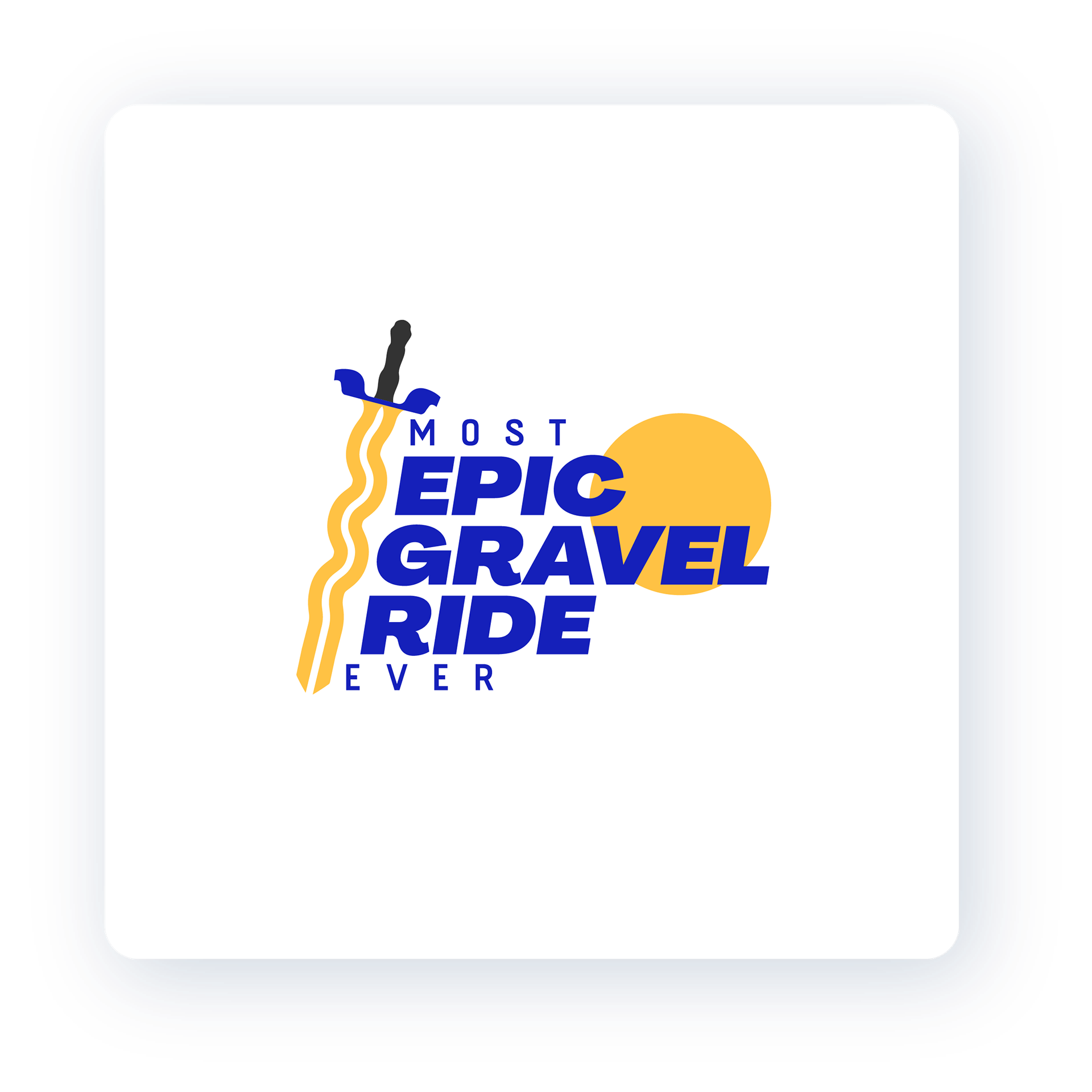
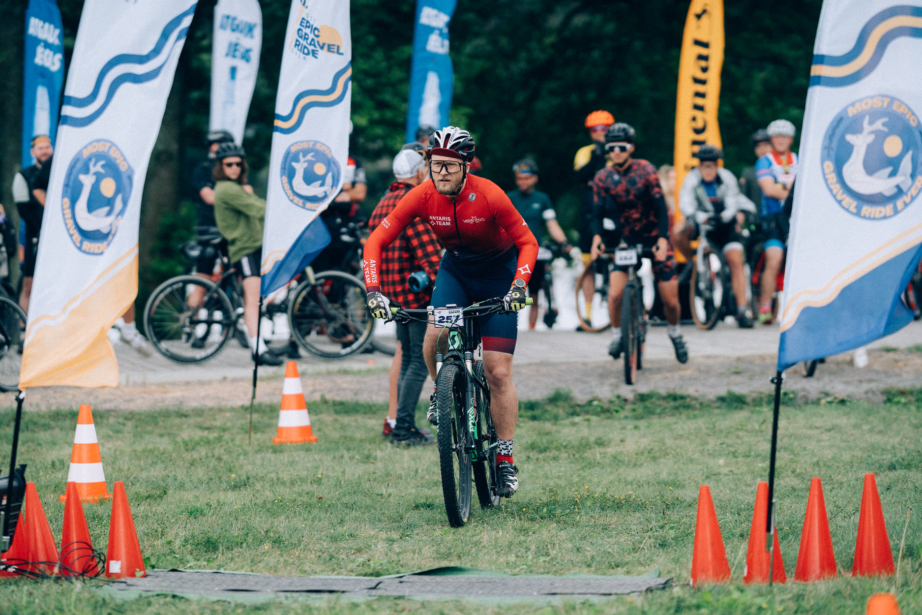
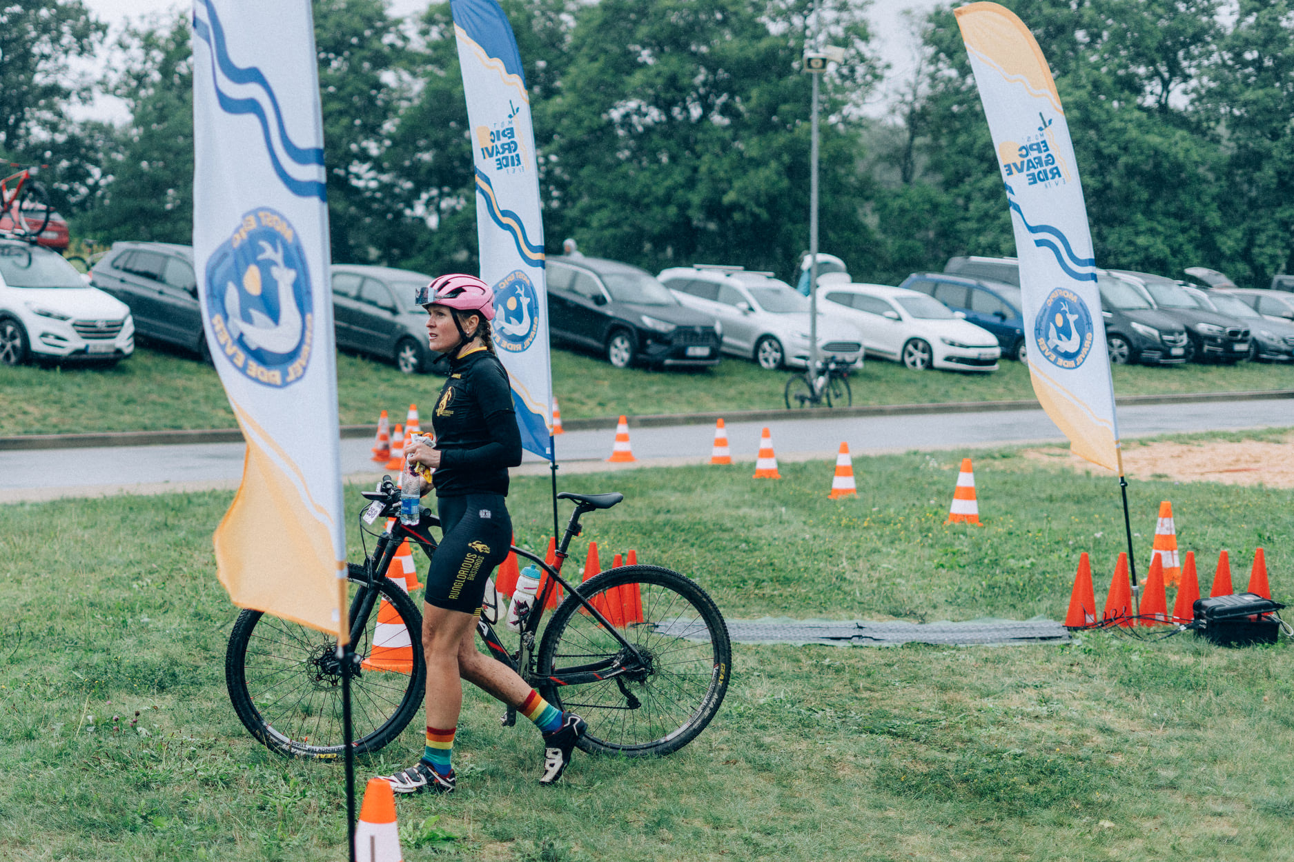
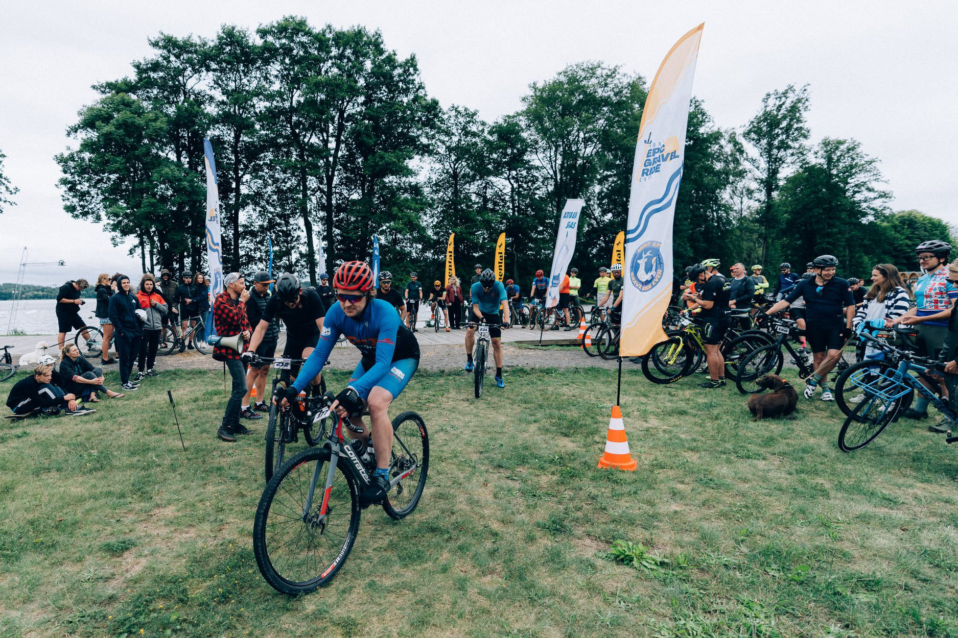
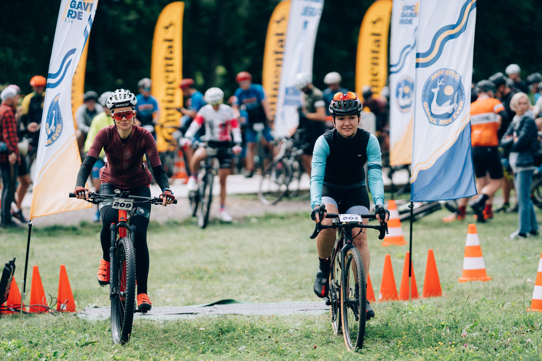
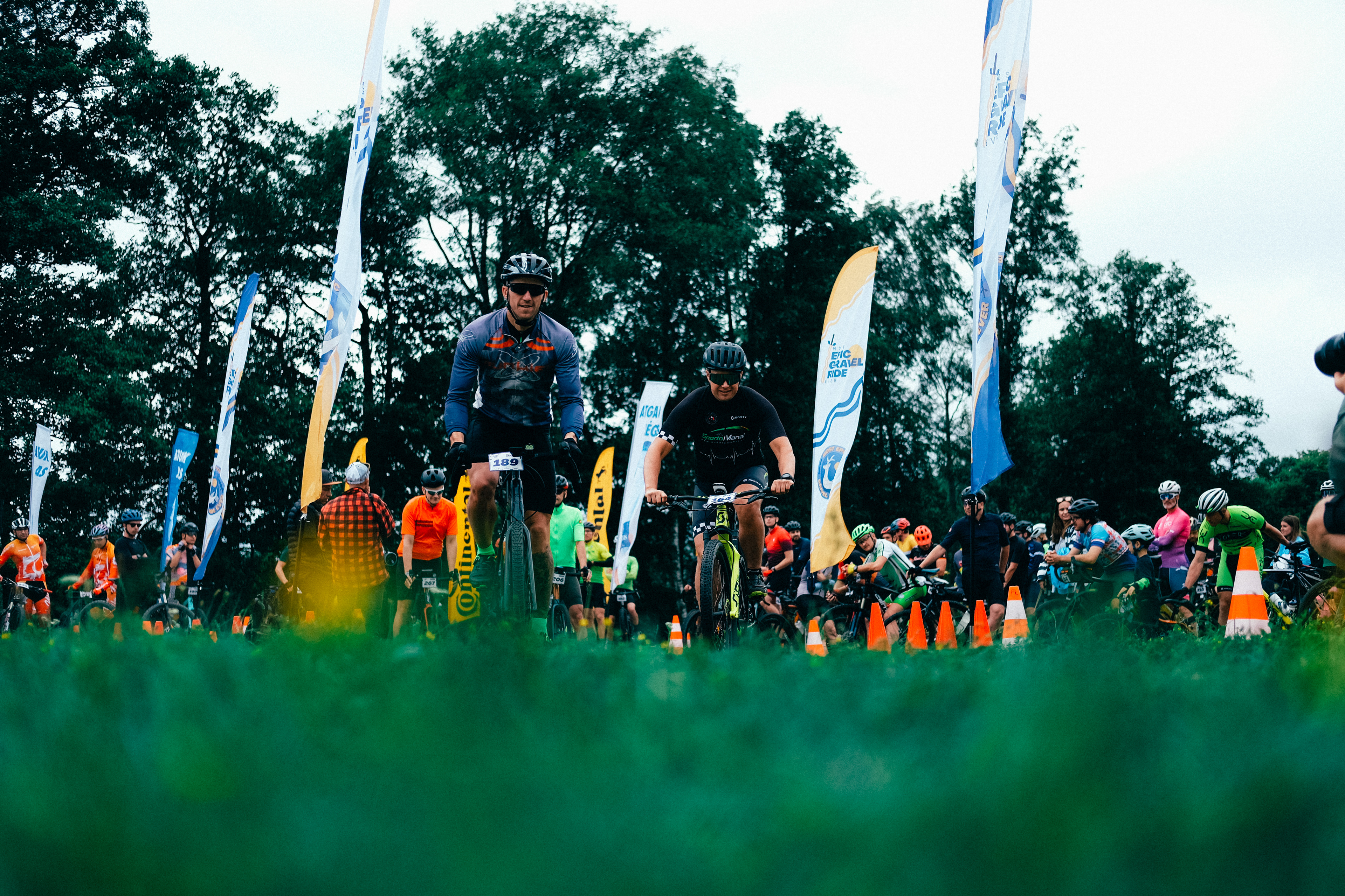
MOST EPIC
GRAVEL RIDE EVER
GRAVEL RIDE EVER
Objective
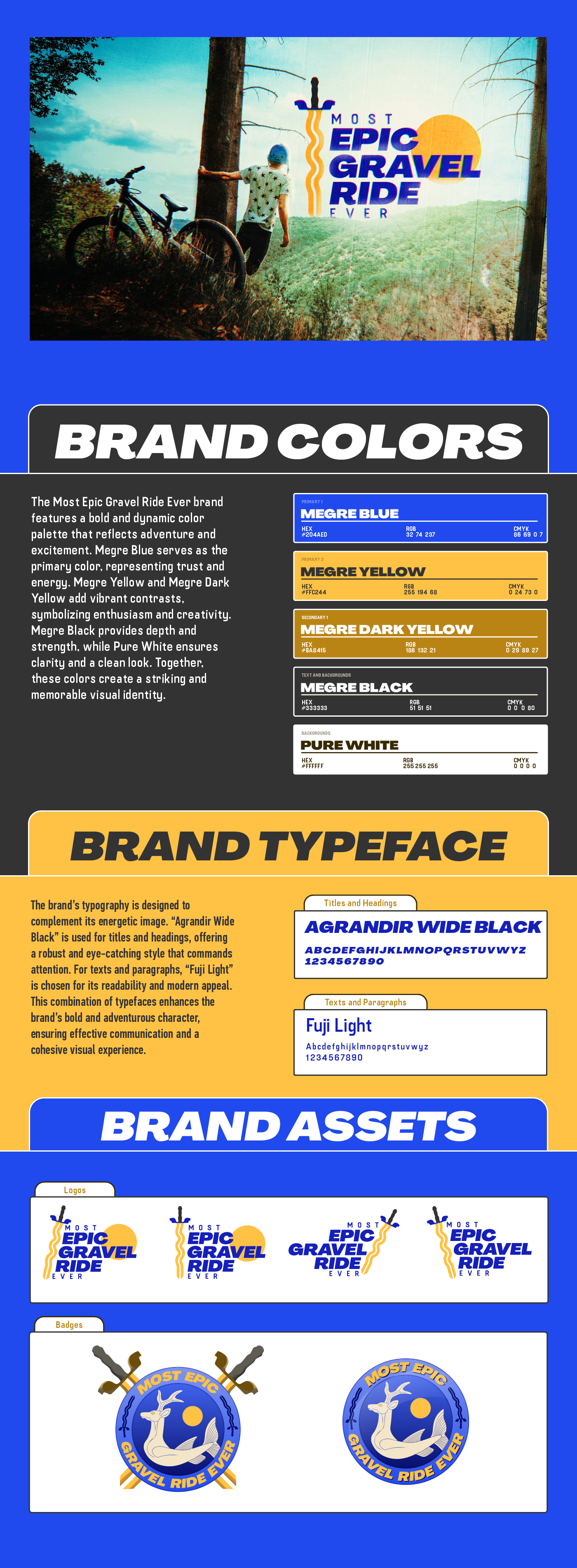
The objective of the Most Epic Gravel Ride Ever brand is to offer an exhilarating gravel ride experience across various road types in different Lithuanian cities, with a particular focus on the city of Zarasai. The event aims to incorporate elements from the Zarasai coat of arms into the branding, creating a connection with the local heritage and enhancing the event’s cultural significance.
Solution
To achieve this, the brand design incorporates the sword from the Zarasai coat of arms, symbolizing strength and resilience. Additionally, the curves used in the design represent the diverse and dynamic roads participants will encounter. This blend of historical elements and modern design creates a powerful and engaging visual identity that highlights the adventurous spirit of the event while paying homage to its cultural roots. The use of bold colors and strong typography further reinforces the brand’s energetic and epic nature.

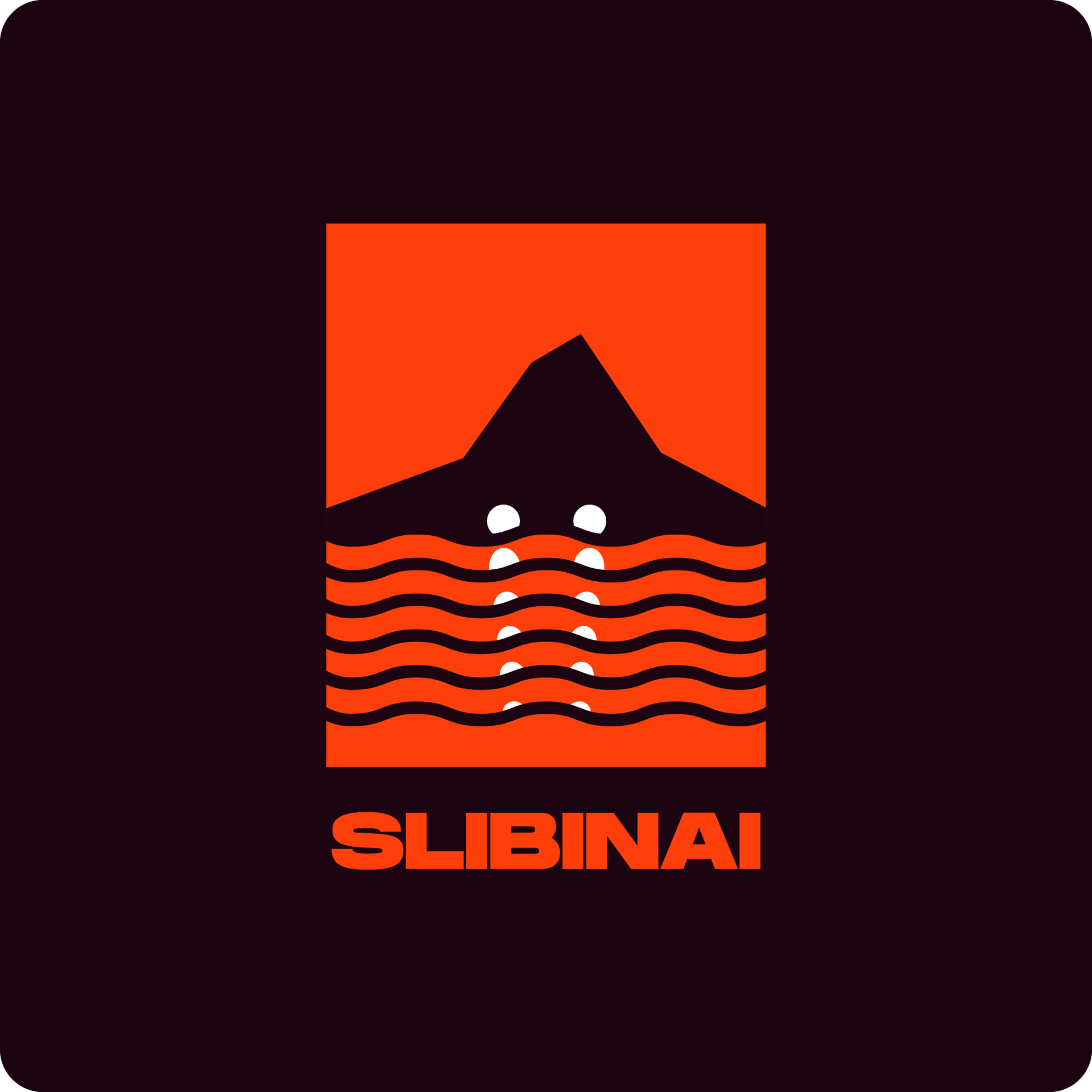
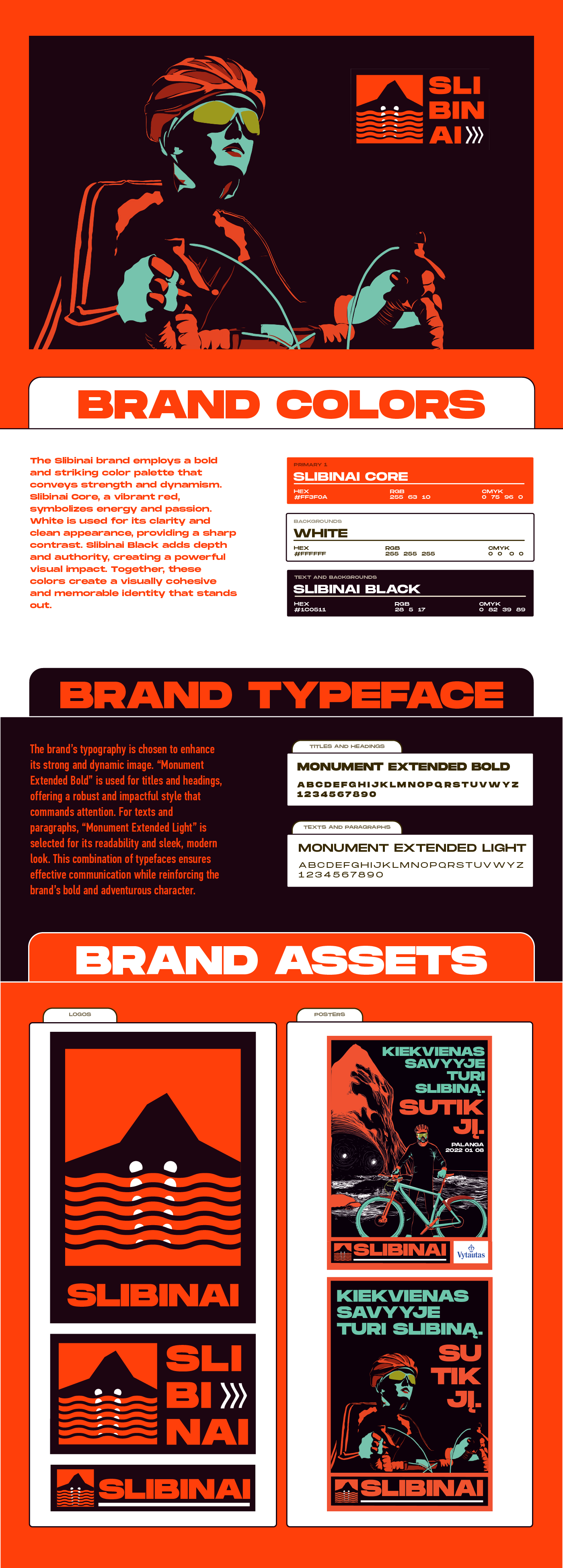
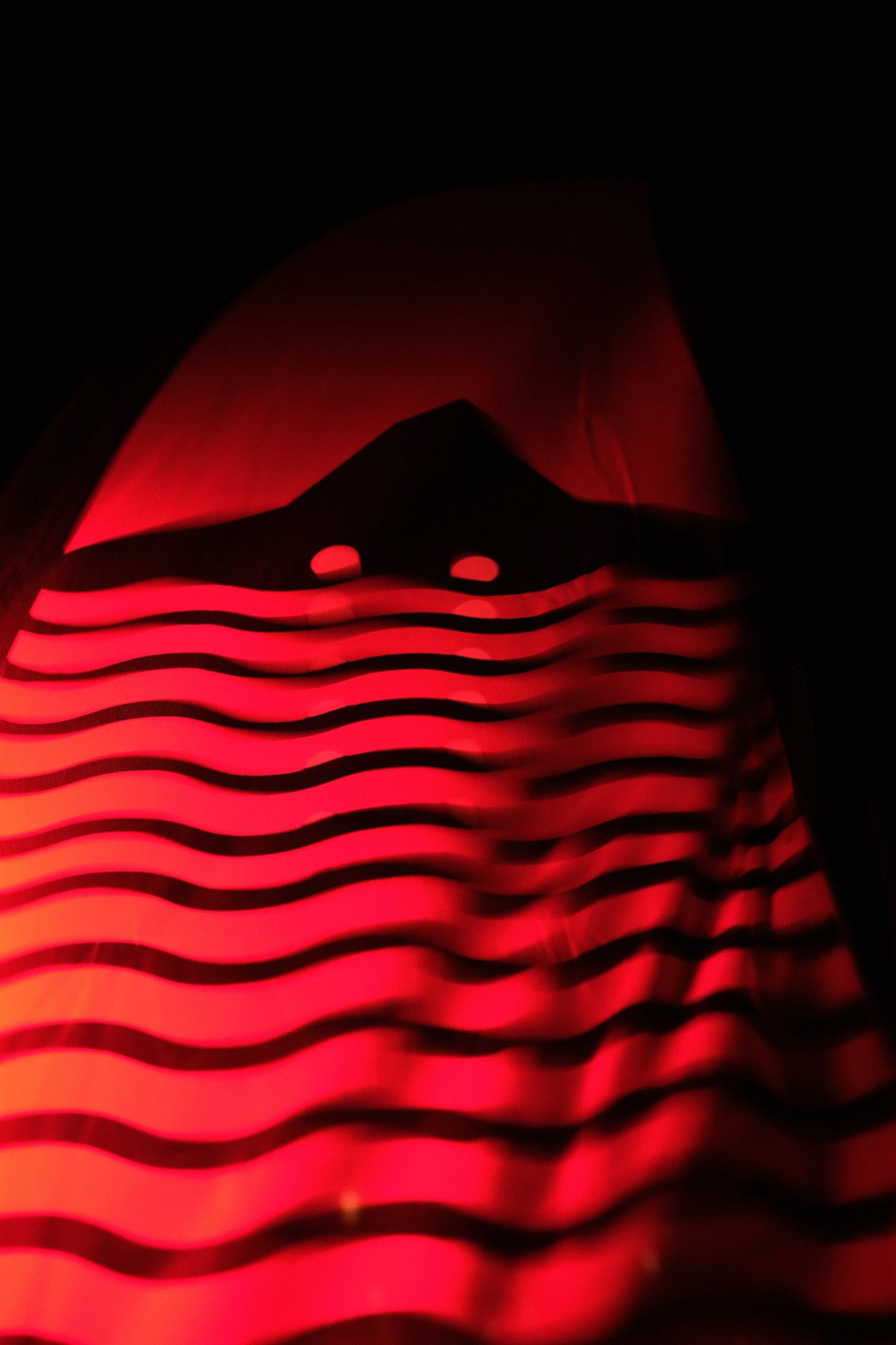
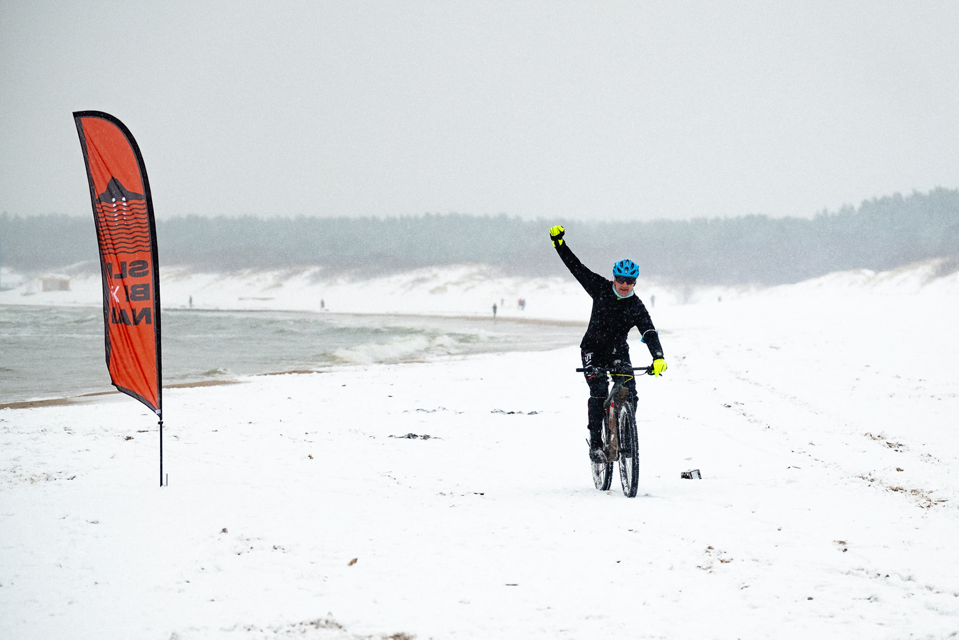
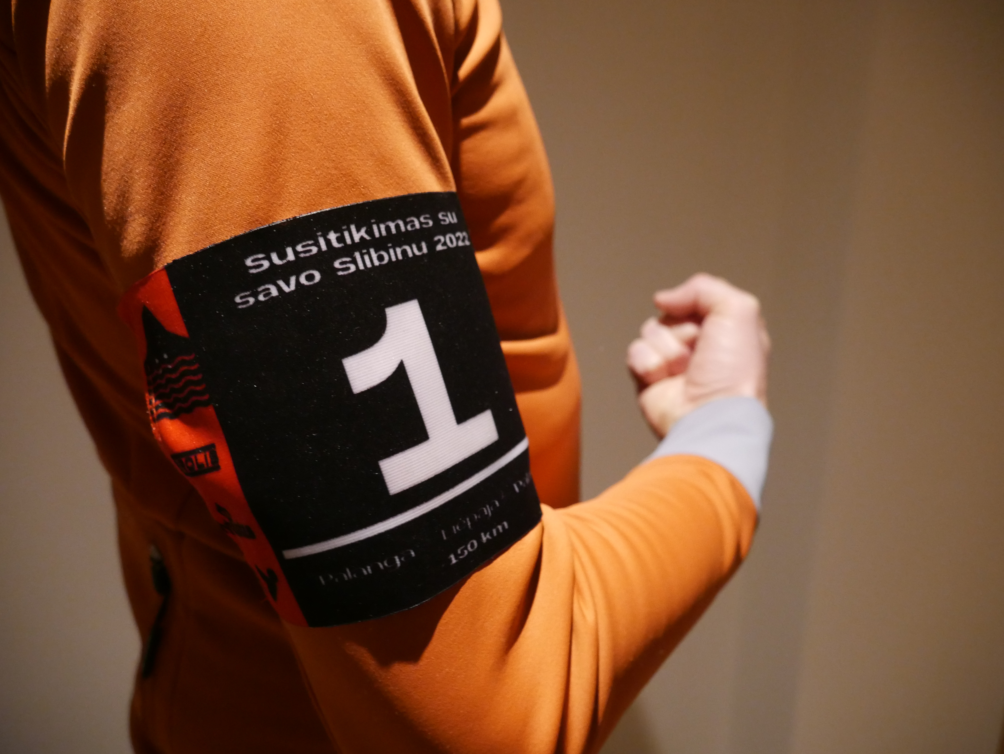
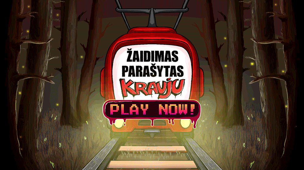
SLIBINAI
Objective
The objective of the Slibinai brand is to represent the most challenging ride set in extreme seaside conditions. The logo aims to evoke the iconic imagery of a stone cave with illuminated eyes, reminiscent of traditional Lithuanian paintings from the region. This connection to local heritage and the depiction of rugged natural elements emphasize the intense and demanding nature of the ride.
Solution
To bring this vision to life, the Slibinai brand employs strong, bold visuals with high contrast, incorporating elements inspired by surf brands. This approach ensures a striking and impactful aesthetic that captures attention and conveys the toughness of the event. The bold color palette and powerful typography reinforce the brand’s adventurous and dynamic character, making it memorable and instantly recognizable. These design choices effectively highlight the extreme nature of the ride while paying homage to the region’s cultural and natural heritage.